
Customizing your store's design
Learn how to customize your store header, sections, and desktop design to match your brand
Getting Started
To customize your store's design, go to your store page and click the "Edit Design" button. This will open the design customization pane where you can configure all aspects of your store's appearance.
The edit design pane is organized into tabs for each design category: Header, Sections, and Desktop. Each tab contains the settings and options specific to that area of your store.
Header Design
In the Header tab, you can select a layout that best represents your brand. This will be applied to your store header. Choose between:
1. Editorial Cover
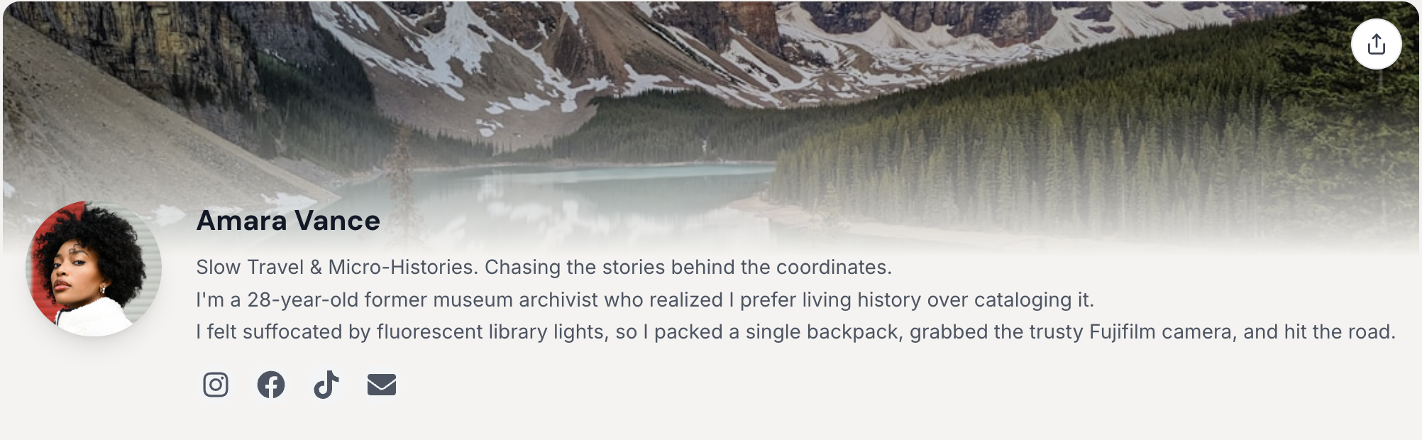
Tall hero with a soft gradient fade into your name, bio, and socials below. Inspired by growth-form overlays — elegant, editorial, and ideal for showcasing travel photography.
2. Classic Centered
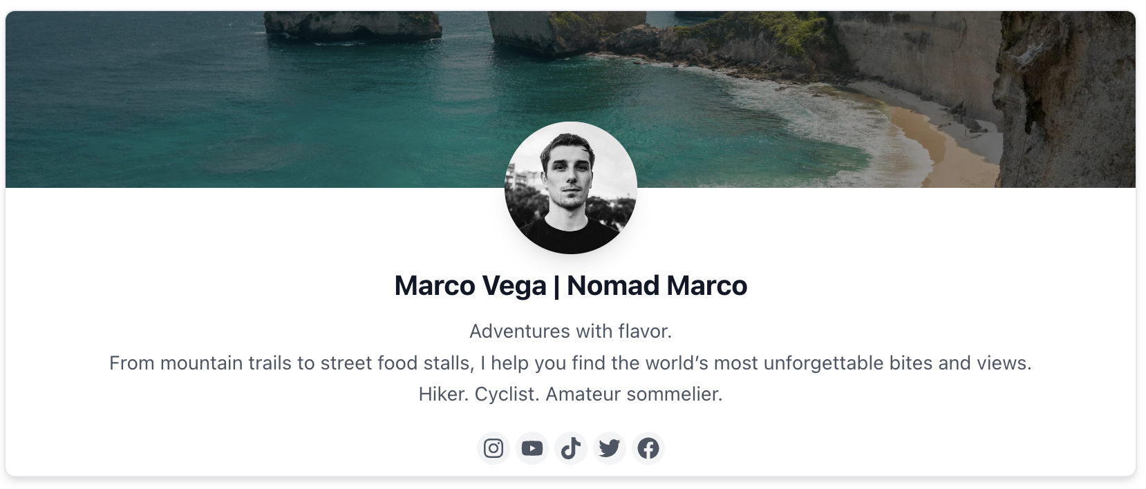
Profile picture centered over hero, bio and socials below. Perfect for a clean, traditional look that puts focus on your profile.
3. Hero Overlay
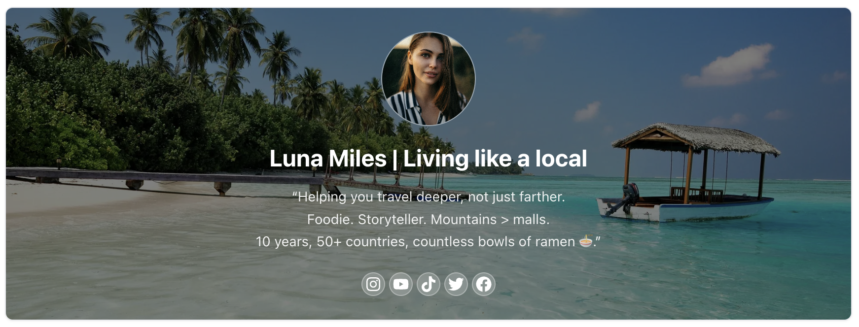
Full hero image with all info overlaid in white text. Ideal for showcasing stunning travel photography while maintaining readability.
4. Profile Left
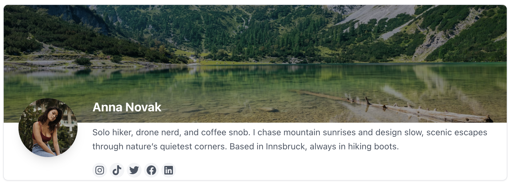
Profile picture on left, name and bio on right, socials below. A structured layout that keeps your profile and content side by side.
Section Design
In the Sections tab, you can set the default design that will be applied to all sections. Individual sections can override this design. Choose between:
1. Classic

Bold gradient background with overlay, perfect for showcasing products. Creates visual impact and draws attention to your content.
2. Minimal

Clean white background with subtle borders, elegant and professional. Best for a sophisticated, content-first approach.
3. Card
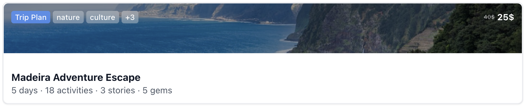
Elevated card design with shadow, modern and eye-catching. Adds depth and creates a premium, contemporary feel.
Desktop Design
In the Desktop tab, you can customize how your store appears on desktop devices. These settings give you control over the desktop experience while maintaining mobile optimization.
Header Position
Choose where to position the header in desktop view. You can select from top, sticky, or floating positions to best match your design preferences and user experience goals.
Sections Default Design
Choose the default view for desktop visitors. Users can still toggle between views, but this sets the initial experience. Options include grid, list, or masonry layouts optimized for larger screens.
💡 Pro Tip
Start with a design that matches your brand personality, then test different options to see what resonates best with your audience. You can always change your design settings later as your store evolves.
How to create your first product
Step-by-step guide to creating your first travel product in Tripix Studio